Visual Design
Often times, when we see good design, we might just feel like it’s “vibes” or part of the visual subjectivity that governs good art. This actually isn’t entirely true. There are concrete tips and visual principles (derived mainly from psychology/cognitive science) that can help you make your user interfaces look professional and polished.
Why is good visual design important? There’s the “aesthetic-usability effect” where people perceive that “aesthetic” interfaces are often more intuitive than less aesthetically pleasing ones. Obviously, that’s not necessarily true, but we’ll take the positive cognitive bias while we can. More importantly, the opposite is true: people may be disinclined to trust non-aesthetic things, even though they are perfectly legitimate (think of the websites of famous older academics that use plain HTML, Comic Sans, and have no CSS…).
There are many online resources for learning the basics of design, such as Apple’s foundational design guidelines. Below, I’ll pull out some general things that might aid you in the design of your tools:
Clutter is the enemy
Clutter in the visual domain results in higher cognitive load. Designs that look “clean” and “professional” often are just not cluttered. What are some ways we can reduce clutter?
-
Visual hierachy. You already know from your sketchnotes that the most important information in a page should be the largest and have the heaviest weight.
-
Grids are good. How about laying out information? A grid based system helps. I would recommend using a grid based system, where you decide on how big the “smallest” element you want in your tool is (such as a button or text input field )
-
Typefaces matter. Typograph exists to honor content. Choose a typeface that matches the character of the text. For instance, if you are presenting small menu options, it does not make sense to use a highly decorative cursive font which would make the content hard to read. Figma has many great built-in fonts, and Google fonts makes it easy to integrate their fonts into web applications. Lastly, here are some premade font pairings you can select to use with Figma.
-
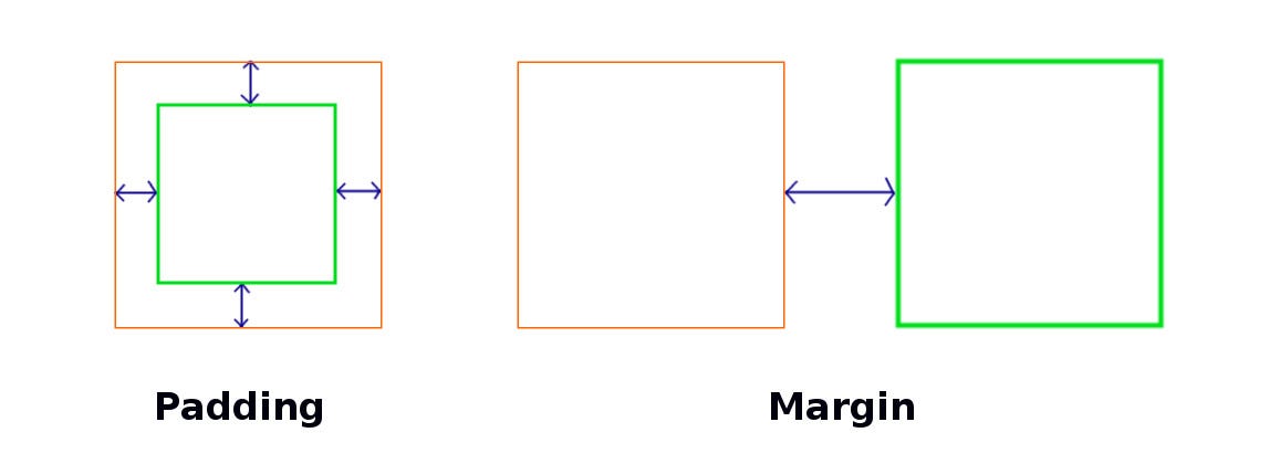
Give it room to breathe. The biggest mistakes I see in beginner designers is often in alignment, margin, and padding. Your content should be aligned with each other. Padding (in CSS) refers to the space outside the content that is often still “associated with” the content (like wearing a puffy jacket that pads you) while margin refers to the content’s personal space—the space it has between other elements. Messy uses of padding and margins often result in more cluttered designs.
Gestalt principles
Gestalt principles are principles from psychology that explain how our brain interprets specific visual signals. Here are a few that may help in your tool’s visual design:

1. Figure-ground

We group objects into either foreground or background. The illusion above works because we can either see the vase as the foreground or the pair of heads as the foreground. Your tool should have a distinct foreground (usually where the content is) verus background, like the examples below.
2. Similarity
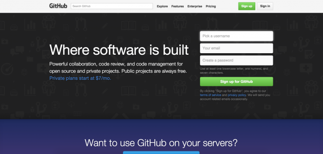
Items which share a similar visual characteristic are perceived as more related than items that are dissimiliar. We can see this with an older Github sign up screen, where the text input fields look similar, but different from the text on the left, which is also different from the bottom blue section.
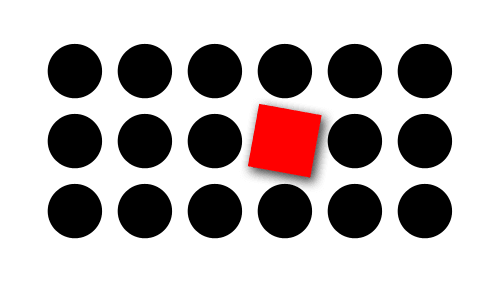
3. Proximity
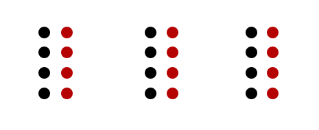
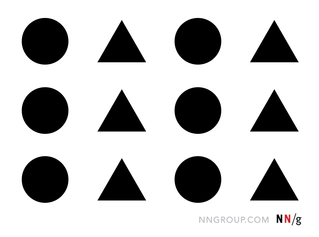
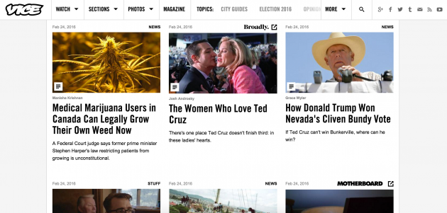
Things that are closer together appear more related than things that are spaced farther apart. Negative space is so powerful it even overrides similarity of color and shape, like shown above. (We see 3 groups of 8 dots, 4 which happen to be black and 4 which happen to be red, as opposed to 3 groups of 4 black dots and 3 groups of 4 red dots.) In the example below, the nearness of the image, headline, and byline make us understand that they are all associated with one news story.
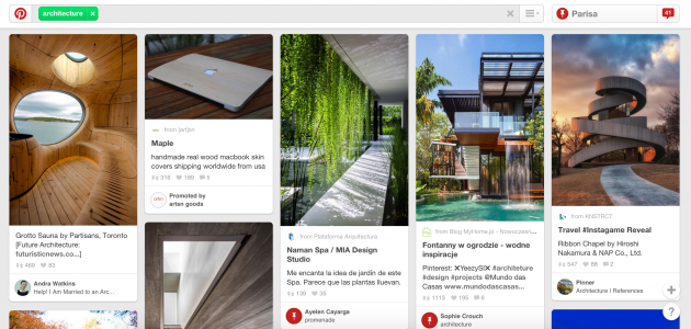
4. Common region
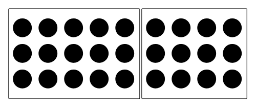
Related to proximity, when objects are in the same closed region, we perceive them as being grouped together. Basically, containers can help you organize things together, like how Pinterest does below.
5. Focal point
Contrast drives attention. Whatever stands out visually will capture the viewer’s attention first. Websites take advantage of this by making action buttons they want you to click on (sign up! Give us your money!) often a bright color in contrast with their surroundings.

For further reading, here’s another good summary of more principles from interaction-design.org. How many gestalt principles do you incorporate in your tool design?
Modern design systems (UI trends)
The current (for around the past decade) dominant trend in how we see and interact with web and app based UI is Google’s material design.
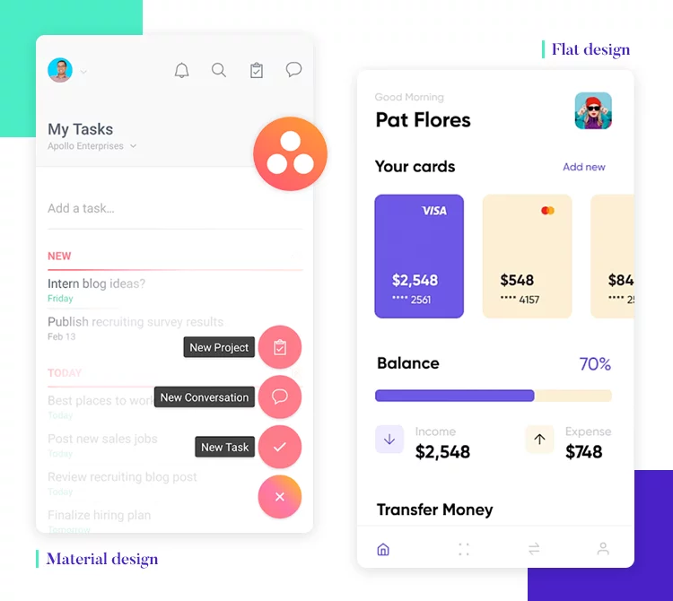
In class we learned about skeumorphism as a dominant design trend. After skeumorphism, the tech industry largely transitioned to flat design, which focused on solid shapes (often with rounded corners) and strong color palettes. Material design evolved in response to flat design—it’s called material because it emulates paper as a material. Design elements often have drop shadows and many UIs utilize the z-axis to show a sense of depth and layering. Grids are also important in material design (and pair well with front-end grid-based web frameworks like Bootstrap).
The material design website includes a Figma pack if you would like to make your tool in the material design system. It helps reduce the decisions of what your components are going to look like: as long as your tool speaks the language of modern design, the more important thing is its interactions and what it enables.
Microsoft’s version is Fluent Design. What’s the difference between the two? I’m not so sure…
Usability
Good visual design is more than just aesthetics: it is also about usability and accessibility. For instance, your colors should be accessible to people with color blindness, and there exists online tools (like this one) that will simulate that for you. Other ways to improve design accessibility is to make sure your icons are big enough (e.g., for older adults) and you have alt text for images (so they work with screen readers).
The center for universal design believes that things should be designed to be usable by all people, to the greatest extent possible, without adaption or specialized design. Their principles include providing flexibility in use, perceptible information, tolerance for error, and low physical effort. How many of these principles can your tool satisfy?
Inspiration
Good artists copy, great artists steal. - Pablo Picasso
Inspiration can be a powerful force if you’re feeling stuck on (or are getting started with) your visual design. There are many design portfolio websites like Behance or Dribble. Search to see what others have done that may inspire your tool or your components.
Software Systems Design
It might seem intimidating to create a functioning interactive tool from scratch. It is, in fact, much more work than a weekly programming problem set. You have to account for diverse user inputs and build many working parts that talk to each other. Luckily, there are some strategies and frameworks to help break down the work for you.
Finite State Machine
One way to model your tool is through a finite state machine (FSM): an abstraction that is useful for sequential logic and control functions. A FSM contains a series of states (such as uploading, making a post, editing a visualization, etc.) and transitions between the various states (such as users may transition between the viewing and editing states by clicking a specific icon or button).

What would an FSM for your tool look like? It is worth thinking about its main states and how users transition between the states, even if your FSM is not a 100% complete one. (Think about your Figma: the screens are states and your prototype transitions are the FSM transitions!) How can you represent the different states in code?
Web development 101
Every web page has a DOM (document object model) that treats HTML code as a node based tree, where each node is an object in HTML. The DOM is what you access when you right click your browser window and press “inspect” to open up the console. HTML builds components (like <div>s, or <button>s), CSS visually styles the components, and Javascript is the “programming” part where you can apply computation to the components or store data. Javascript is also able to programmatically inject HTML elements in the DOM; for instance, document.getElementById("body").innerHTML = "<div></div>" adds a <div> element to the DOM body. All of these exist on the client side, which any user of a webpage can see and read the code of. More advanced modern JS frameworks (like Node.js or Next.js) also incorporate a server side of Javascript functions that are hidden from users. Most heavy data processing occurs on the server side.
Model-View-Controller

The Model-View-Controller (MVC) is a software design pattern that separates internal data representations (the model) from UI elements (the view). Any user interaction goes to the controller, which links the model and view together. User input changes the model which also changes the view.
You are not required to use the MVC framework for your tool: it is simply one option available to you. For the software system diagram project milestone, it is helpful to think about your code in this model. Identify, at a high level, which functions you would need in your model, what their inputs and outputs would be, and how they would change the view (if at all).
For instance, let’s say we’re writing a Javascript web app that’s a to-do list. The general architecture would look like:
class Model {
  constructor() {}
}

class View {
  constructor() {}
}

class Controller {
  constructor(model, view) {
    this.model = model
    this.view = view
  }
}

const app = new Controller(new Model(), new View())
The Model class contains your data structures and logic. It would contain functions that users can do, but all the code in the class would only be “backend” elements. For instance,
class Model {
  constructor() {
    // The data structure for this tool is an array of objects with fields
    // id (int), text (string), and complete (bool).
    this.todos = [
      {id: 1, text: 'Make my FSM', complete: false},
      {id: 2, text: 'Code model functions', complete: false},
    ]
  }

  addTodo(todoText) { ... }

  deleteTodo(id) { ... }

  completeTodo(id) { ... }
You can easily test out these functions by calling them like app.model.addTodo('Take a nap'). Models don’t have any understanding of the inputs or the outputs, but just handles the data operations.
The View class actually modifies the DOM and injects HTML to result in front end changes. For instance, all the JS below is creating new DOM elements:
class View {
  constructor() {
    // The root DOM element
    this.app = this.getElement('#root')

    // The title of the app
    this.title = this.createElement('h1')
    this.title.textContent = 'Todos'

    // Create the visual representation of a todo list in the
    // "todoList" variable, which is a <ul> container
    this.todoList = this.createElement('ul', 'todo-list')

    // Append the title and todoList to the app
    this.app.append(this.title, this.todoList)
  }

  // This function actually displays the todos
  displayTodos(todos) {
    todos.forEach(todo => {
      const li = this.createElement('li')
      li.id = todo.id
      const checkbox = this.createElement('input')
      const span = this.createElement('span')

      // Append nodes to the todoList container
      this.todoList.append(li)
    })
  }
}
The model is set up and the view is set up, but we don’t have a way of connecting them–we don’t have a way for users to actually create and see a todo list. In the controller, we should call the displayTodos function in the view every time our data in our model updates.
First, we create a function onTodoListChanged which will call view.displayTodos every time model.todos are changed, and we call it once on set up to display the initial values. But how do we actually know when model.todos is changed? Through creating a binder function in the Model class which we call in the Controller class.
We then call the onTodoListChanged callback in each of the functions that change the todo list (adding a todo, deleting it, completing it) in the Model class as well.
Lastly, we need to set up event listeners in the View class which handles user input events like clicks that signal adding, deleting, and completing a todo item. Finally, we bind the event listeners to the handlers in the Model class.
class Model {
  ...
  bindTodoListChanged(callback) {
   this.onTodoListChanged = callback
  }

  addTodo(todoText) {
    ...
    this.onTodoListChanged(this.todos)
  }
  deleteTodo(id) {
    ...
    this.onTodoListChanged(this.todos)
  }
  completeTodo(id) {
    ...
    this.onTodoListChanged(this.todos)
  }
}

class View {
  ...
  bindAddTodo(handler) {
    //add an event listener when submitting the form
    this.form.addEventListener('submit', event => {
      event.preventDefault()

      if (this._todoText) {
        //pass the text of the new todo item to the handler, which passes it to the model
        handler(this._todoText)
        this._resetInput()
      }
    })
  }

  bindDeleteTodo(handler) {
    //add an event listener for click events on the todo list
    this.todoList.addEventListener('click', event => {
      if (event.target.className === 'delete') {
        const id = parseInt(event.target.parentElement.id)
        //pass the id of the todo item to be deleted to the handler, which passes it to the model
        handler(id)
      }
    })
  }

  bindCompleteTodo(handler) {
    //add an event listener for if the user checks off the checkbox
    this.todoList.addEventListener('change', event => {
      if (event.target.type === 'checkbox') {
        const id = parseInt(event.target.parentElement.id)
        //send the checkbox id to the handler, which passes it to the model
        handler(id)
      }
    })
  }
}

class Controller {
  constructor(model, view) {
    this.model = model
    this.view = view

    // Display initial todos
    this.onTodoListChanged(this.model.todos)
  }
  // create a function that calls the view...
  onTodoListChanged = (todos) => {
    this.view.displayTodos(todos)
  }

  // ...bind said function to the model
  this.model.bindTodoListChanged(this.onTodoListChanged)

  //handlers for model functions
  handleAddTodo = (todoText) => {
    this.model.addTodo(todoText)
  }

  handleDeleteTodo = (id) => {
    this.model.deleteTodo(id)
  }

  handleCompleteTodo = (id) => {
    this.model.completeTodo(id)
  }

  //bind them to the view
  this.view.bindAddTodo(this.handleAddTodo)
  this.view.bindDeleteTodo(this.handleDeleteTodo)
  this.view.bindCompleteTodo(this.handleCompleteTodo)
}
For a more detailed walkthrough of building an MVC from scratch, check out this blog post.
Modern day Javascript
Popular current frameworks like React or Node.js take a slightly different approach than MVC. React, for instance, is a front-end framework for creating reusable UI components, while Node.js is more of a back-end Javascript ecosystem with many libraries and APIs created by other developers.
You are not by any means required to use modern frameworks for your tool, but more likely than not you will run into them “in the real world” as a software engineer (or company proprietary versions of them), so learning them now would be a nice skill to have. Here’s a Medium post that presents a pretty comprehensive overview of them (minus Next.js, is the current rage, which is a full-stack React framework).